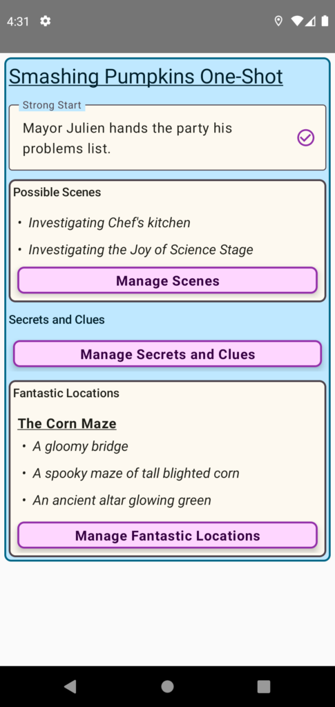
I made some good work on the Session Detail Screen. I thin it is looking pretty clean. I had originally had some outlined cards for each item in a category, but it looked too busy. Especially, if it was the same color as the call to action buttons.
I think there can be some improvement for the title text. But that may be something I need to tackle at another time.

The bulleted Text looks pretty good. FYI this is all made in Compose. Since its not obvious how to make bulleted text, I built my own composable.
@Composable
fun BulletedText(
    text: String,
    modifier: Modifier = Modifier,
    color: Color = Color.Unspecified,
    fontSize: TextUnit = TextUnit.Unspecified,
    fontStyle: FontStyle? = null,
    fontWeight: FontWeight? = null,
    fontFamily: FontFamily? = null,
    letterSpacing: TextUnit = TextUnit.Unspecified,
    textDecoration: TextDecoration? = null,
    textAlign: TextAlign? = null,
    lineHeight: TextUnit = TextUnit.Unspecified,
    overflow: TextOverflow = TextOverflow.Clip,
    softWrap: Boolean = true,
    maxLines: Int = Int.MAX_VALUE,
    minLines: Int = 1,
    onTextLayout: (TextLayoutResult) -> Unit = {},
    style: TextStyle = LocalTextStyle.current
) {
    Text(
        text = "\u2022  $text",
        modifier,
        color,
        fontSize,
        fontStyle,
        fontWeight,
        fontFamily,
        letterSpacing,
        textDecoration,
        textAlign,
        lineHeight,
        overflow,
        softWrap,
        maxLines,
        minLines,
        onTextLayout,
        style
    )
}